A New Copy!
Chapter 10A of Daniel S. Vacanti’s Actionable Agile Metrics for Predictability: An Introduction (buy a copy today) is a very short chapter (I should have planned to include this in chapter 10B, but hindsight is 20/20) covering a discussion of histograms but given the time and space we can spend additional time with an example. The chapter is titled Cycle Time Histograms.
What is a histogram? A histogram is a graph that shows the population of a data set within ranges. How the data is spread across those ranges is called the distribution. The shape of the distribution will generate questions.
Given that histograms are a visualization of data, nothing tells the story better than an example. We will use the data that we used in the discussion of scatter plot diagrams in the main section of Chapter 10. (I have appended the list of data at the end of the entry)
A histogram is constructed by putting data into ranges (called bins) and then counting the number of occurrences in each bin. Using a range of 10 for each bin yields the following histogram.
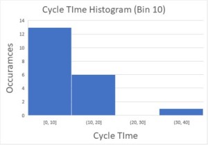
Bin Size of 10Looking at the histogram generates questions that the team could use to make changes to how they are working and to become more predictable. For example, one question might be what caused the one story to be between 30 – 40 days and could/should the team take action to avoid that issue in the future. The goal of collecting and analyzing any measurement data is to ask questions and take action. If you are not going to do anything with the data don’t waste your time collecting the data.
Data are grouped together to help viewers of the data to see the distribution. If we set the bin size to 1 (the same as no range) the histogram of the same data would be less useful. An example:

Bin Size of 1
There are a number of ways to determine bin size (here is a great article on establishing bin sizes).] While some of the techniques for establishing bin size can be very technical, start simple and remember that the ranges should include all of the data, the bins should be the same size, and don’t go crazy with the number of bins.
Histograms are another way to plot data suggest questions so that problems can be diagnosed and changes made.
Previous Installments
Week 2: Flow, Flow Metrics, and Predictability
Week 3: The Basics of Flow Metrics
Week 4: An Introduction to Little’s Law
Week 6: Workflow Metrics and CFDs
Week 8: Conservation of Flow, Part I
Week 9: Conservation of Flow, Part II
Week 11: Introduction to Cycle Time Scatterplots
Support the author (and the blog), buy a copy of Actionable Agile Metrics for Predictability: An Introduction by Daniel S. Vacanti
Get your copy and begin reading (or re-reading)!
Data for graphs:
| Date | Cycle Time | |
| Story 1 | 1/1/2018 | 1 |
| Story 2 | 1/2/2018 | 4 |
| Story 3 | 1/3/2018 | 7 |
| Story 4 | 1/4/2018 | 3 |
| Story 5 | 1/5/2018 | 7 |
| Story 6 | 1/6/2018 | 9 |
| Story 7 | 1/7/2018 | 0 |
| Story 8 | 1/8/2018 | 11 |
| Story 9 | 1/9/2018 | 40 |
| Story 10 | 1/10/2018 | 1 |
| Story 11 | 1/11/2018 | 6 |
| Story 12 | 1/12/2018 | 8 |
| Story 13 | 1/13/2018 | 1 |
| Story 14 | 1/14/2018 | 11 |
| Story 15 | 1/15/2018 | 15 |
| Story 16 | 1/16/2018 | 6 |
| Story 17 | 1/17/2018 | 5 |
| Story 18 | 1/18/2018 | 11 |
| Story 19 | 1/19/2018 | 12 |
| Story 20 | 1/20/2018 | 13 |

January 14, 2018 at 4:54 am
We now have Vacanti’s three visualizations for cycle-time data described to us.
1) Cumulative Flow Diagrams
2) Cycle Time Scatter plots
3) Cycle Time Histograms
The Histogram data starts to show you the distribution of the curve.
Vacant’s keen observation (p. 184) “Histograms in our world [knowledge work] usually have a big hump on the left and a long tail to the right” Meaning most things (e.g., user stories) complete in a reasonable time, but not all things. Remember last week’s discussion on those outliers seen in the scatter plots.
January 15, 2018 at 12:37 pm
Thanks for making that point. It is so easy to assume a normal curve when if you visualize the data it is nowhere near normal (statistically speaking).
January 14, 2018 at 10:14 pm
[…] This week we tackled Chapter 10a of Actionable Agile Metrics for Predictability: An Introduction by Daniel S. Vacanti. Histograms are another powerful way of visualizing data Remember to buy your copy today and read along, and we will be back next week! The link: Week 12: Cycle Time Histograms […]
January 20, 2018 at 11:56 pm
[…] Week 12: Cycle Time Histograms […]
January 21, 2018 at 10:15 pm
[…] Week 12: Cycle Time Histograms […]
January 28, 2018 at 12:04 am
[…] Week 12: Cycle Time Histograms […]
January 28, 2018 at 10:21 pm
[…] Week 12: Cycle Time Histograms […]
February 4, 2018 at 1:55 am
[…] Week 12: Cycle Time Histograms […]
February 4, 2018 at 10:10 pm
[…] Week 12: Cycle Time Histograms […]
February 10, 2018 at 11:57 pm
[…] Week 12: Cycle Time Histograms […]
February 11, 2018 at 10:16 pm
[…] Week 12: Cycle Time Histograms […]
February 17, 2018 at 11:56 pm
[…] Week 12: Cycle Time Histograms […]
February 18, 2018 at 10:10 pm
[…] Week 12: Cycle Time Histograms […]
February 25, 2018 at 10:10 pm
[…] Week 12: Cycle Time Histograms […]
March 3, 2018 at 11:56 pm
[…] Week 12: Cycle Time Histograms […]
March 4, 2018 at 10:11 pm
[…] Week 12: Cycle Time Histograms […]
March 10, 2018 at 11:57 pm
[…] Week 12: Cycle Time Histograms […]
March 11, 2018 at 9:08 pm
[…] Week 12: Cycle Time Histograms […]
March 20, 2018 at 8:55 pm
[…] Week 12: Cycle Time Histograms […]
May 7, 2019 at 5:46 am
[…] Conservation of Flow, Part II Week 10: Flow Debt Week 11: Introduction to Cycle Time Scatterplots Week 12: Cycle Time Histograms Week 13: Interpreting Cycle Time Scatterplots Week 14: Service Level Agreements Week 15: Pull […]
December 31, 2023 at 2:32 am
[…] Week 12: Cycle Time Histograms […]